Nation Branding – “a graphic negotiation with the past, present and future”

nation branding

I have just attended a presentation by guest speaker, Javier Gimeno-Martínez (of VU University, Amsterdam), in which he spoke about how the branding of Belgian regions combines references to local history with hopes for the united EU future.

Javier described nation branding as “a graphic negotiation with the past, present and future”. He observed that location brands (or indeed, many corporate brands too) incorporate flags, coats of arms, or other historicaly-established symbols in order to use “the weight of the past to legitimise new institutions”. Symbols of the past, he observes, are used by established institutions to maintain their power, and by new institutions to legitimise their place in a competitive market.

for nation branding in particular, historical or traditional symbols reflect the citizen’s perception of a “shared place” and “shared community” that may have existed even before the nation was officially formed. Belgium was only recognised as a country in 1939, but it’s people recognise a shared community that extends back far further into history. The same can be said of many commercial brands, which may have only existed for a few years, but which seem to express longevity and tradition, and a community with a shared cultural history.

Javier noted that it is the audience that primarily drives the design of these brands, as it is the people of a nation who perceive their own history. Moreover, those that have most vocal interest in their national identity – nationalists – tend to have strong views about their cultural history.
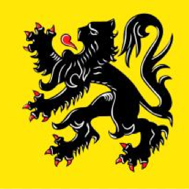
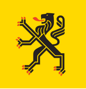
The lion that adorns Belgium's coat of Arms, updated for new audiences.
The lion that adorns Belgium’s coat of Arms, updated for new audiences.
An attempt to modernise the Belgium lion by simplifying its contours, but maintaining the connection to perceived history.

He discussed Belgian regional brands in relation to Belgian’s tripartite personal identities, as Flemish/ French/Dutch, as well as Belgian and European. Historical branding of European locations has been particularly meaningful since the establishment of the EU, which represents modernity and unity. In most cases (except, he observed, Sweden), local regions feel the need to assert their local histories in contrast to the modernity of the EU. Even Brussels, which is the centre of the EU, is branded with an iris, drawn in art nouveau style. The image uses EU colours – blue and yellow – but maintains a historical motif and style. to maintain a connection with the past. Javier notes that such historical motifs almost always trump the values expressed by modern symbols. Even when national or regional brands do incorporate modern elements, it is usually only in colour and style. The central motif is almost always historical in its origins.

Brussels' iris brand uses EU colours but borrows directly from the city's Art Nouveau history.
Brussels’ iris brand uses EU colours but borrows directly from the city’s Art Nouveau history.

It is interesting to consider these ideas in relation to the proposed redesign of the New Zealand flag. Though NZ is a relatively recent nation, its current and proposed flags aim to acknowledge histories. The current flag includes a Union Jack, thereby reinforcing the connection to its colonial past as part of the British Empire; the proposed flags nearly all contain Maori elements, thereby aiming to reclaim the history that was eroded/denied by colonial powers. Those proposed designs are an attempt to assert NZ’s cultural history before it became an official nation. Both flags contain historical elements, but reflect different histories.

Existing and proposed New Zealand flags.

Methodology

It can be difficult to reflect on one’s working method, as a lot of what we do seems to be instinctive. We tend to take our methods for granted, unaware that there are many different ways of responding to a single object or theme. Typically, understanding methodology begins by identifying what is most important to you. For example, you may be more concerned with colour, style, composition, meaning, audience reception, political context, etc. Not everyone will have the same priorities when viewing the image.

When different people view an image or conduct a project, they will approach it in different ways. For example, when viewing a photo, one person may try to quantify its contents by considering the ratio of one colour to another; another viewer may consider the political or social connotations of the context in which the image appears; another viewer may may seek to understand the meaning as intended by the artist; yet another viewer may be more concerned with how the audience interpret the piece. All of these are valid, but different, approaches to the same image.

Some research methodologies are standardized, so that researchers are able to apply an existing methodology that has been used by others before. For example, structuralism involves considering all objects in relation to other things; semiotics separates the properties of the image (or ‘sign’) from its meaning; Marxism proposes that there is no authoritative interpretation of any image, but rather than all interpretations are equally valuable. In reality, most people do not apply any one of these methodologies, but rather take prompts from a variety of different methodologies to understand an image or text in their own way. The video below illustrates how one colleague in photography approaches the question of methodology:

For the Research & Enquiry module, students have been asked to end their blog by reflecting on their working method. This should involve considering how and why you work in the way you do, what your priorities are, and how that may affect your view of the work that you are doing, or the research that you have done.

What is authenticity?

In an article for the Design Observer, Michael Beirut (2005) explores what makes something look ‘real’ or ‘genuine’. Some designers and illustrators make efforts to include markers of authenticity in their work, such as personal flourishes and imperfections. Postmodern graphic designer, Tibor Kalman, found authenticity in vernacular design. He felt that design produced by those without formal design education (such as signs in shop windows, event flyers, etc.) had a genuine ‘innocence’ that was eroded by learning about ‘good’ or ‘bad’ design.

8562696604e1fc3c2a16251532b00120

Beirut seems to equate authenticity to innovation, implying that copying is, by definition, inauthentic. This raises questions about the value of tradition. Isn’t tradition authentic? When designers or illustrators try to achieve an ‘authentic’ style, their first step is usually investigating the historical origins of a style.

a8bab48df38e01ab4252ce926c00bb16

The commercial arts (graphics and illustration) have entered an era of cultural appropriation, in which styles are readily borrowed from elsewhere. Borrowing from another culture without understanding its values can lead to erosion of those values, so that the style becomes superficial (take, for example, Western mandala designs, with borrow Indian style without the religious values that underpin the form in its original use). To that extent, copying can be very inauthentic. So, what are the criteria for authenticity?

classico_jars

Authenticity may be more about the designers/artists themselves than the work they produce. The origins of a person seem to give authenticity to the work that he or she produces. For example, and Italian designer producing a traditional-looking label for a pasta brand is considered more authentic than exactly the same label created by and English designer. Or, for illustration, an image is considered ‘authentic’ if the illustrator has directly experienced what he/she depicts as a core part of his/her biography. Essentially, there seems to be a rule that authenticity requires the creator to have ‘experienced’ (not just observed) his subject. Is this a superficial definition, or does it really matter whether a design is ‘genuine’?

32cb16a35298746916ededd9d967a9af-1

Refereces:

Beirut, Michael (2005), ‘Authenticity: A User’s Guide‘, The Design Observer, 2 August (accessed 10 November 2014)

Sweden’s new national font

1*xOXV3ux04DtxLZ7IrQ_tKQ

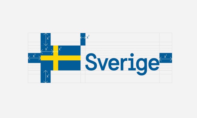
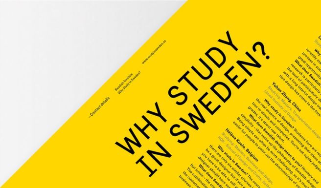
The Swedish Government has commissioned a new national font to be used in all its communications and national marketing (Carlsson, 2014). The font is narrow sans serif, with some slab serifs on a few of the letters. This balance of serif and sans serif – local and universal – is designed to express the Swedish concept of ‘lagom’ (‘just the right amount’) (Carlsson, 2014).

Any design that is selected to represent a nation to a global audience must be a compromise between national identity and universality. Stefan Hattenbach, one of the designers who worked on the font at Soderhavet, says that it was vital to create a font that was not ‘too Swedish’ (Levielle, 2014). Designers of Olympic graphics face the same concerns, knowing that they must express their nation’s culture without alienating international visitors – the designs must be cultural specific and yet inclusive. It is perhaps for this reason that designers at Soderhavet selected a sans serif design, adhering to the Modernist suggestion that sans serif is the most universal style of type, free from cultural or historical connotations.

The response to the font has been mixed. Although commentators generally approve of the design, several question the implications of having a national font. In the past, countries that have employed a national font have done so as part of nationalistic campaigns (see, for example, the use of Blackletter in Nazi Germany).

See an article on Sweden’s font here.

There is a handy article by Eye Magazine on the meanings of various typefaces, here.

141028_EYE_5.jpg.CROP.original-original

References

Carlsson, Sven (2014), ‘Sweden Has its Own Font‘, Matter (accessed 30 October 2014)

Leveille, David (2014), ‘Sweden Hopes to Project a New Image with its Official Font‘, PRI: Arts, Culture & Media (accessed 30 October 2014)

Hohenadel, Kristen (2014), ‘Sweden Has Its Own Font. Should the US?‘, The Eye (accessed 30 October 2014)

Old + New = innovation

A23D: A 3D-Printed Letterpress Font from Adrian Harrison on Vimeo.

The above video demonstrates the first 3D printed letterpress typeface. This is a brilliant example of how traditional practices can be adapted using new technologies. This video also contains an overview of letterpress printing which may be useful for those who have not encountered it before.

Some of the most significant innovations in any field occur as a result of combining two things that have not previously been associated with one another. Combining old and new technologies into a new hybrid form creates opportunities to reconsider the value of something that otherwise seems mundane or outdated. It is a way of preserving and improving the past, while also demonstrating the applicability of new technologies. Hybrids can also occur by combining methods from different disciplines. For example, employing techniques from one discipline to solve problems set in your own field – architectural structures in fashion; computers used for art (we take this for granted now, but the idea was grondbreaking in the 1980s); molecular gastronomy; etc.

Practitioners are able to innovate by taking any existing technique, technology or method and applying it in a new context. The technique/technology does not have to be new itself – it just has to be new to a particular context.


Some thoughts on ‘portfolios’

Some random thoughts…

At application, for the MA as well as thousands of other art courses around the world, students are required to submit a portfolio of work. This is usually a collection of past practice that reflects the students specialisms and abilities. The term ‘portfolio’ is also increasingly used elsewhere: we describe people as having ‘portfolio careers‘ when they drift from one role to another and acquire a range of unconnected skills and experiences; students are required to submit ‘portfolios’ at the end of modules during their studies.

The ‘portfolios’ that students are required to submit for assessment are very different to the portfolio that they must present when they apply for a course. The most significant different is perhaps that the portfolios for assessment are not just collections of work, but rather, records of an investigation that has taken place during the module. This investigation typically yields practical outcomes, but is represented in the portfolio in a variety of forms, including supporting research and development. The term ‘portfolio’ is used here to encourage students to consider the importance of every aspect of their project planning and development, not just the outcome that results at the end of the module.

Universities may, therefore, seem to use the term ‘portfolio’ in contradicting ways, with different expectations each time. This can be confusing for students who have entered the course on the strength of a portfolio of previous work, and have developed an understanding of a portfolio as a collection of final outcomes. It is the responsibility of tutors to enable students to expand their understanding of the portfolio into something that is, more broadly, a collection of a evidence in a variety of forms. It is this approach, that considers the importance of evidence, that leads to the student’s growth during his or her studies. By gathering, reflecting upon, and presenting evidence of a process, the student becomes more reflexive practitioner, and this generally results in more innovative outcomes.

This broader definition of ‘portfolio’ focuses on the value of variety: varied experiences, varied forms of communication, thinking inside and outside of the box. It should not demonstrate the same skill over and over again, but rather, it should show flexibility and an ability to consider a problem from a variety of perspectives. At MA level in particular, students are encouraged not to rely on their existing skills, but rather, to expand and to experiment; to take risks with new things, and to develop all aspects of their creative process.

What is ‘experimentation’?

Towards the end of the Research & Enquiry module you will need to start thinking about your methodology – this is the way that you conduct research, find ideas, interpret sources and images, and respond to your research findings. Part of your practical methodology is usually ‘experimentation’, but this is a difficult word to define. Peter Bil’ak has written an essay on Typotheque which queries the use of the term ‘experiment’ and tries to decipher its meaning for design practice.

Bil’ak writes that the term ‘experiment’ is used ‘to signify anything new, unconventional, defying easy categorization, or confounding expectations’. Importantly, this definition covers not only things that are new for the design world as a whole, but also in your own practice. Experimentation is about giving yourself new experiences; trying something that you haven’t tried before.

He also notes that ‘as a verb, ‘to experiment’ is often synonymous with the design process itself’. Your experiment is not just your outcome, but also your method. It is the way in which you find new ideas, as well as the way that those ideas are expressed in your outcome.

Most importantly, an ‘experimental’ design is valuable for what it teaches you (or your audience). For many designers, this means that the outcome of an experiment doesn’t need to look perfect, so long as it has taught you something valuable. As an MA student, you should be able to articulate the value of your experiments; to identify what you have learnt, with the aim of informing your future projects.


Is illustration too style-led?

Re-blogged from Josh Murr’s ‘Writing and Research‘ (with some minor amendments). Murr proposes that, unlike graphic design, which has eras and movements that can be defined according to a set of values and concepts, illustration is led primarily by style. Does that mean that illustration is, by nature, a superficial practice?

“Illustration and style are things which go hand in hand. In Steven Heller and Seymour Chwast’s book ‘Illustration – A Visual History’ they have categorised all the illustrations in the book into two main categories, Style and Form. They then go on to say, in the preface, that:

‘Style… is chronological insofar as most cultural styles, being markers of particular times and places, signal particular periods.’

Style has a lifespan which eventually dies out in place of the next. This is not a bad thing and the design world may become quite bland if it wasn’t the case, but I think the problem for Illustration is that it too style led, and this in turn impedes it’s development critically.

Luke Best (Peepshow Collective), editorial illustration for the FT book review

Style and limited growth I think are exemplified in the recent insurgence of illustration collectives such as Peepshow Collective and Puck Collective and illustration specific publishers such as Nobrow. Early on these were hailed as a great thing; celebrating illustration like never before and providing a platform for illustrators to come together and seek strength in numbers and to produce work of their own without being ‘tainted by commercial impurities’ (Chwast, 2008, p.9). On paper this sounds like a great thing; for a serious illustrator, creating personal work is a very important thing. But a short browse in the Nobrow shop and you will see that this wonderful opportunity is going to waste.

Illustrators are using the opportunity to produce entirely style led pieces of work. Short comics in a child-like hand drawn style are in abundance and every single one seems to be the same. The books made up of pretty image after pretty image with a simple joke thrown in here and there – the simple style isn’t a gateway to let the strong narrative, or deeper meaning shine through. It is purely a single facet, a layer of prettiness printed nicely on lovely paper.”

Reference:
Chwast, Seymour (2008), Illustration: A Visual History, New York: Abrams.


Drawing Lives – Reportage At Work

This post is an example of how you might write an entry for your annotated bibliography:

In Drawing Lives (Midgeley, 2010), Julia Midgeley explores how drawing is still in active use as a way of recording the work of other professions. She describes, for example, the practice of artists’ in residence at archeological sites. Midgeley writes mostly from her perspective as a practitioner, making personal observations throughout. She makes particularly interesting observations about the relationship between artists and surgeons, noting that she has encountered a range of people working in hospitals who, formally or informally, draw the medical activities that take place around them. Archaeologists too, she notes, are drawers, as part of their role is to map the location of the artefacts that they find, before they are removed from the trenches. Midgeley makes distinctions between the “fly-on-the wall” drawings produced by reportage illustrators, illustrating archaeologists at work, and the “forensic” drawings produced by the archaeologists themselves.

screenshot-2016-10-05-14-25-59
Forensic drawing of a trench by the archeologist Julian Thomas.
screenshot-2016-10-05-14-26-04
The same trench, with Julian Thomas working on it, observed by reportage illustrator Julia Midgeley.

Reference:
Midgeley, J. (2010), “Drawing Lives – Reportage at Work”, Studies in Material Thinking, Vol. 4.